Website Design & Development
Bank Website Design in 2026: Trust Moves Up, Hero Images Fade, and AI Stays Backstage
August 17, 2026 · 8 min read · MPC Studios
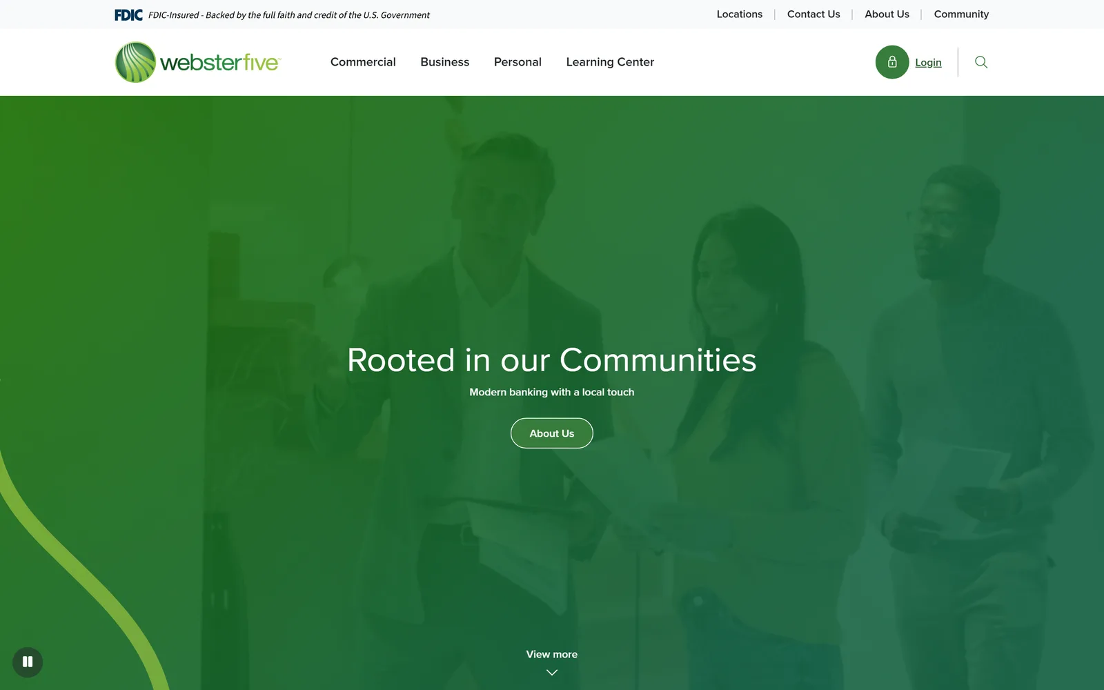
We look at a lot of bank homepages. Between client work and the monitoring tools we run internally, we track sites from the largest national brands down to single-branch community banks, and 2026 has been the busiest stretch of bank website activity we can remember. Camden National Bank shipped a refreshed site in July with a banner at the top welcoming customers to the new experience. Webster Five greets first-time visitors with a guided tour of its redesign. And 22nd State Bank in Alabama skipped the redesign conversation entirely and launched a whole new digital brand at always.bank. Closer to home, our client Texas Regional Bank relaunched at trb.bank in May.
Look at enough of these launches side by side and patterns start to repeat. Here are the five we think matter, and what they suggest about where banking on the web is headed:
- Trust signals move to the top of the page. The FDIC digital sign sits above the logo,
.bankdomains are spreading, and fraud education gets homepage real estate. - The fintech arms race reaches community banks. Account opening happens in real time, and the design language is converging on Silicon Valley minimalism.
- The hero image is disappearing. The banks that made full-width photography famous are the ones walking away from it.
- Services diversify while navigation simplifies. Wealth and advice join the menu, and information architecture becomes the hardest part of the job.
- AI stays backstage. Adopted aggressively behind the scenes, mentioned on the homepage only as a threat.
Trust Signals Are Top Priority
Every redesign in this group moved something trust-related higher on the page. We wrote earlier this year about how banks and law firms earn trust online; this is what it looks like in practice, and three moves show up again and again.
The FDIC Sign Moves Above the Logo
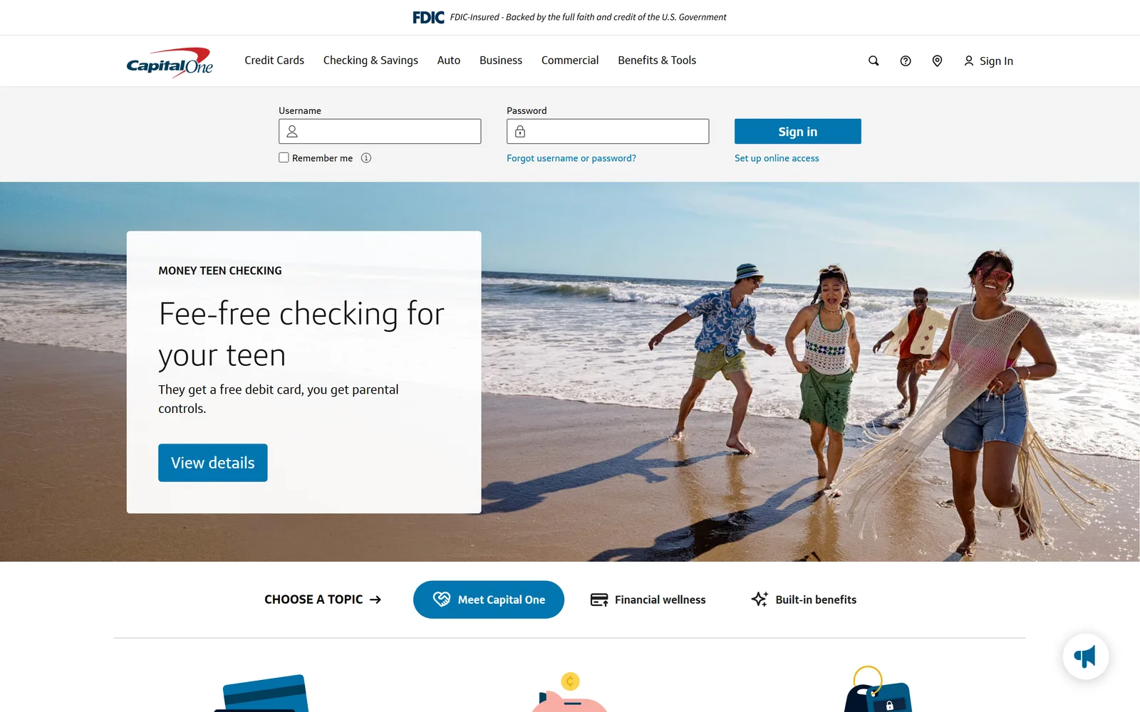
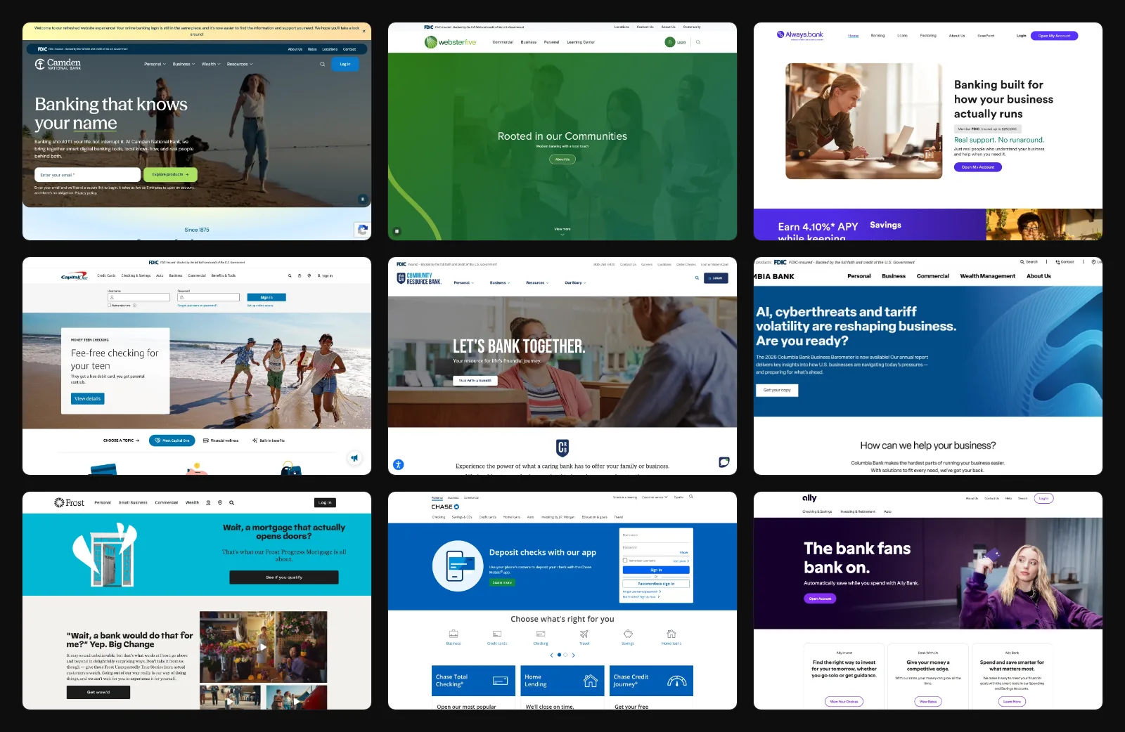
Pull up capitalone.com and read the page from the top. Before the logo, before the navigation, before any product pitch, there is a black government seal and a single line of italic text: FDIC-Insured, backed by the full faith and credit of the U.S. Government. The same strip sits at the top of Camden National, Community Resource Bank, Columbia Bank, and Webster Five.
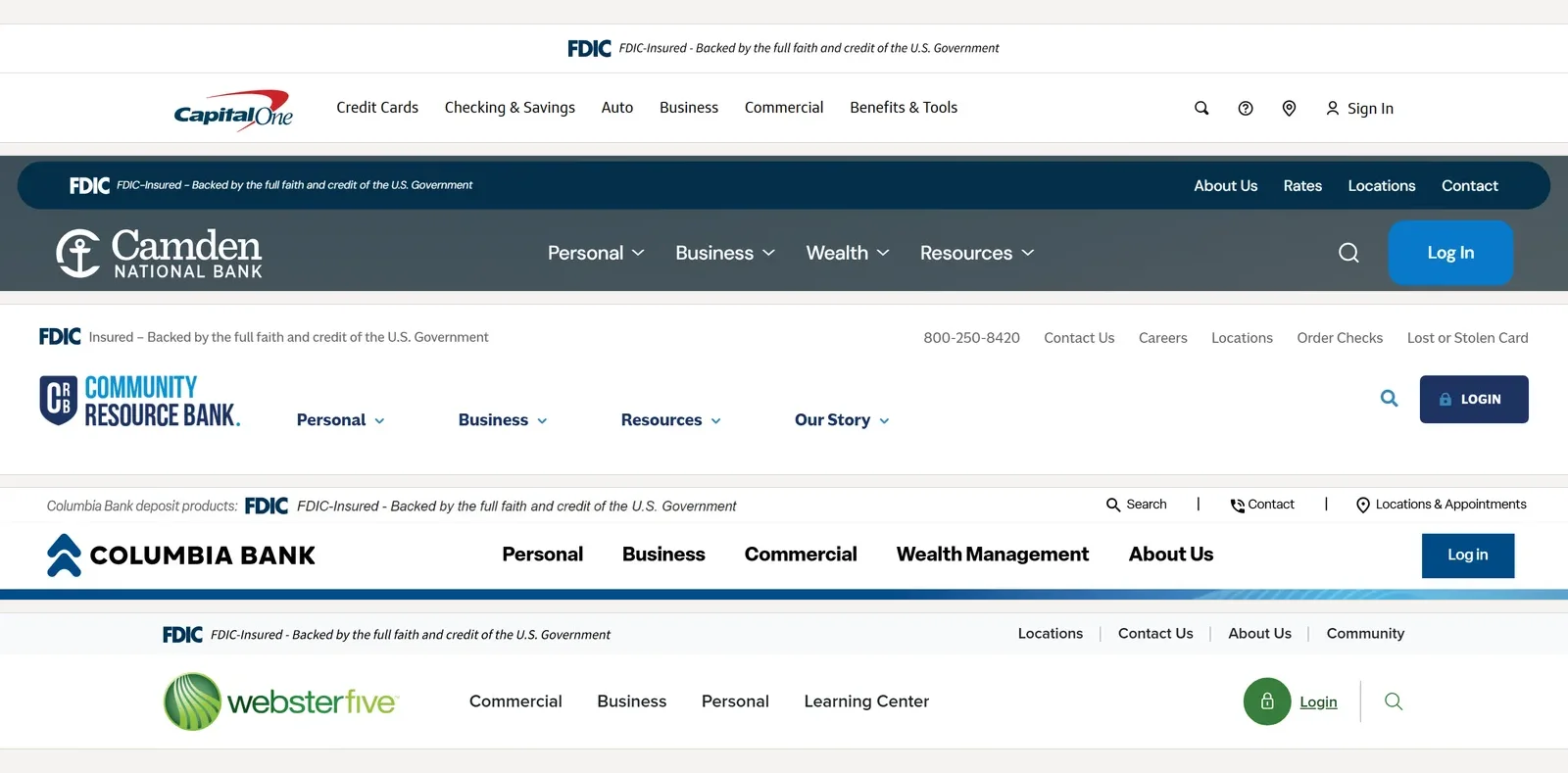
That strip is the FDIC official digital sign, and banks are shipping it well ahead of the deadline. When a regulator hands you a standardized, recognizable trust mark, putting it at the very top of the page turns out to be good marketing as well as good compliance.
.bank Is Finally Gaining Momentum
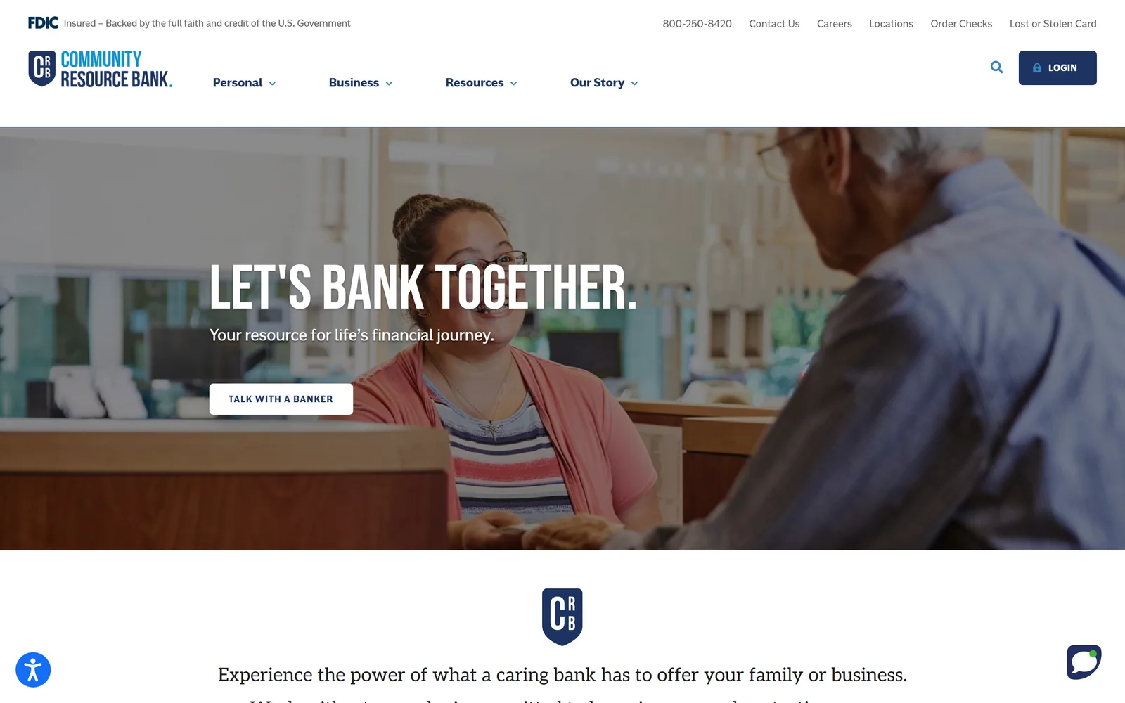
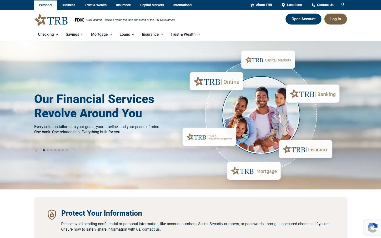
The .bank domain tells the same story. It is a top-level domain (the part of the web address after the dot) that only verified, chartered banks can register. fTLD Registry Services, the industry-owned company behind it, checks a bank's charter and requires security measures like email authentication before a registration goes live. A criminal can spoof yourbank.com with a lookalike address, but there is no path to registering yourbank.bank. Camden National runs its entire site at camdennational.bank. Community Resource Bank adopted crb.bank as part of its redesign. 22nd State Bank went furthest and made the domain the brand itself: always.bank. Our client Texas Regional Bank's redesign shipped on trb.bank this spring, with the FDIC sign sitting beside the logo in the header. The Financial Brand has tracked this migration as a direct response to phishing.
 crb.bank
 trb.bank
Fraud Education Takes Center Stage
The urgency behind all of this is easy to trace. Generative AI has made convincing phishing cheap to produce at scale, autonomous AI is starting to hunt for software vulnerabilities on its own, and Deloitte's Center for Financial Services projects that AI-enabled fraud losses in the U.S. could reach $40 billion by 2027. Banks are responding on the content side too. Fraud-prevention articles now occupy prime homepage real estate, Community Resource Bank greets visitors with a security reminder before it shows them a single product, and Texas Regional Bank's homepage places a Protect Your Information notice directly beneath the hero.
$40B
Projected annual U.S. fraud losses enabled by generative AI by 2027
3 of 9
Surveyed banks that now run their primary site on a .bank domain
Camden National, Community Resource Bank, always.bank
5 of 9
Surveyed homepages that already display the FDIC official digital sign above the logo
Trust used to be implied by marble columns and a vault door. Online, it has to be spelled out, verified, and pinned to the top of the page.
The Fintech Arms Race
The second pattern is the one community banks feel most directly: the account-opening flow and the visual language of fintech are arriving at the same time.
Real-Time Account Opening
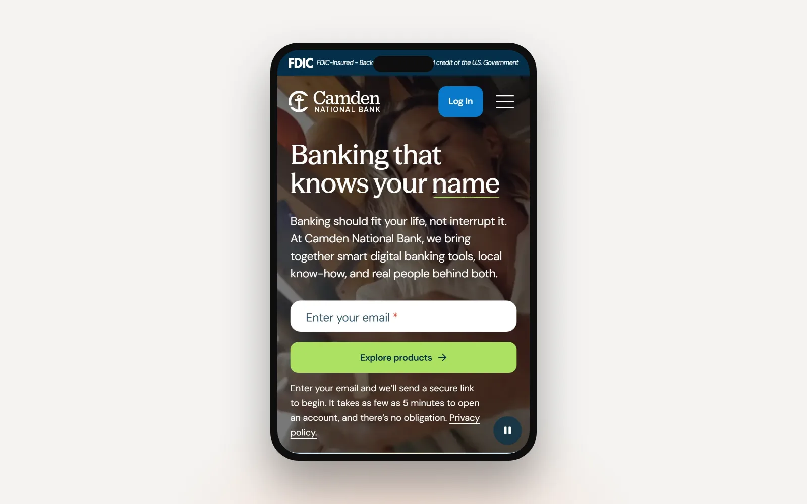
Camden National's new hero puts an email field where the marketing copy used to go. Type your address and the site sends a secure link to start an application, with a note that opening an account takes as few as five minutes. A few years ago that same spot on a community bank homepage held a generic contact form, and the actual account opening happened in a branch, on paper.
Real-time account opening, with identity verification and funding handled entirely online, belonged to the largest banks and the fintechs for years. Vendor platforms have pushed it down-market. When 22nd State Bank launched always.bank in May, it built the whole brand on a fintech-style stack from Linker Finance, aimed at small businesses that want to open and run accounts without visiting a branch. The results banks report when they smooth out this path are hard to ignore. When Paragon Digital redesigned Savings Bank of Walpole's site around clearer account paths, 67% more visitors started an application online.
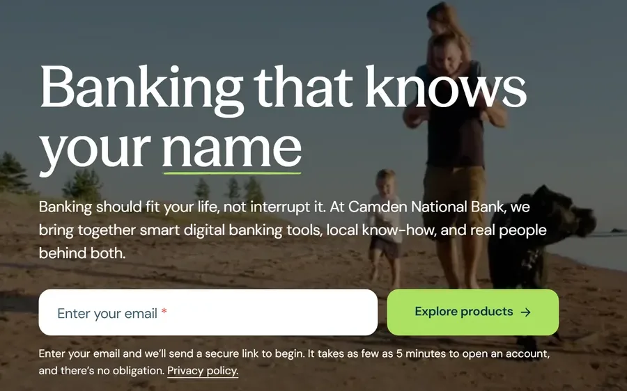 Camden National
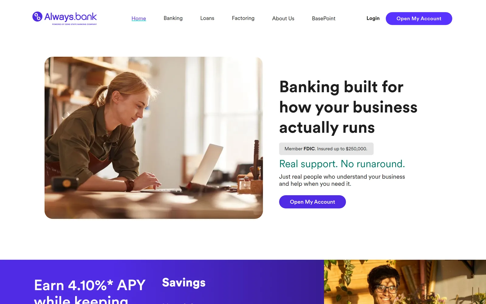 always.bank
Minimalist Design, Silicon Valley Style
The design language is converging on fintech too. Chase's homepage is a stack of flat color blocks with short sentences and a login box. Ally trims its navigation to three choices and its hero to one headline and one button. This is the Silicon Valley playbook: strip the page down until the one action you want a visitor to take is obvious. On a bank site that same minimalism does quiet trust work, because a clean, fast page reads as a bank that has its act together.
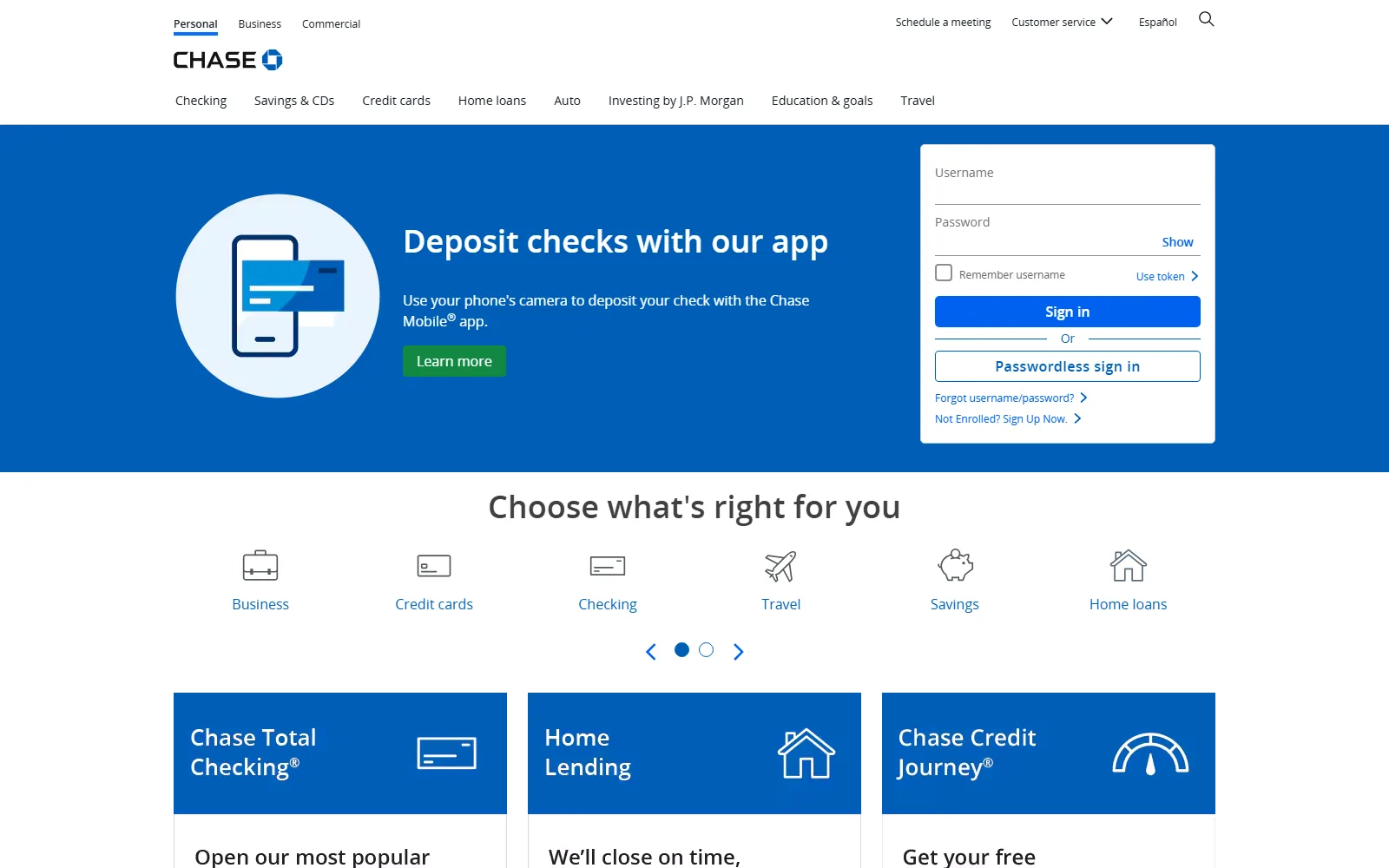 Chase
Chase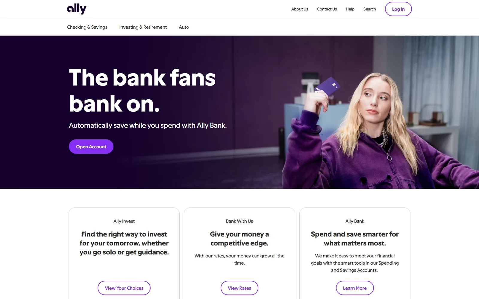 Ally
AllyThe Disappearing Hero Image
For two decades the formula for a bank homepage was stable: a full-width photograph, a headline about community, and product links below the fold. Watching that formula break down at the banks that defined it may be the clearest turning point in bank web design in years.
Frost Was Ahead of the Curve
Frost Bank famously filled its homepage with full-viewport photography submitted by its own customers, usually Texas landscapes and nature shots, and the rotation changed all the time. Frost retired the format a couple of years ago, well ahead of the curve. Today frostbank.com opens with a flat teal illustration of a front door and a headline about mortgages, and the customer stories have moved down the page into a row of video thumbnails.
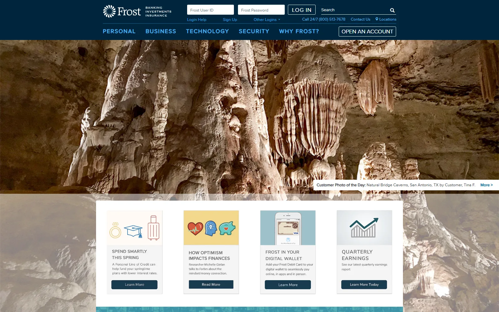 2019
2019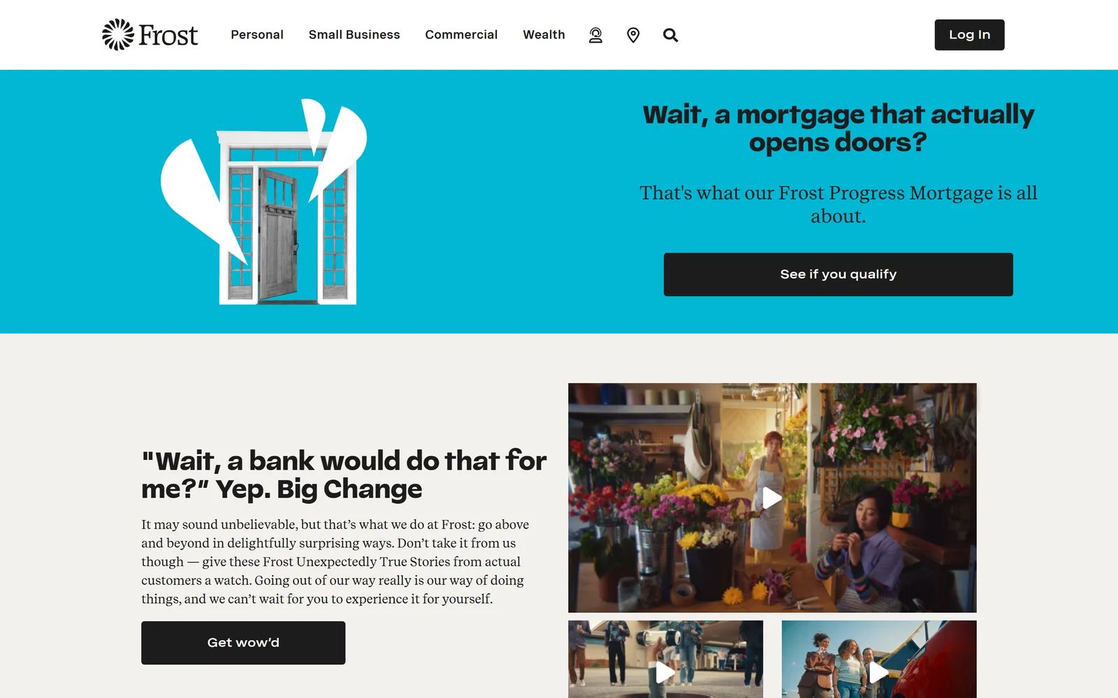 2026
2026The national brands are catching up now. Chase runs a homepage of flat color blocks with no hero photography at all, Ally has cut its homepage down to one headline and one button, and Capital One has pushed its remaining photo below the FDIC sign, the navigation, and the sign-in module.
Umpqua's Design Legacy Goes Abstract
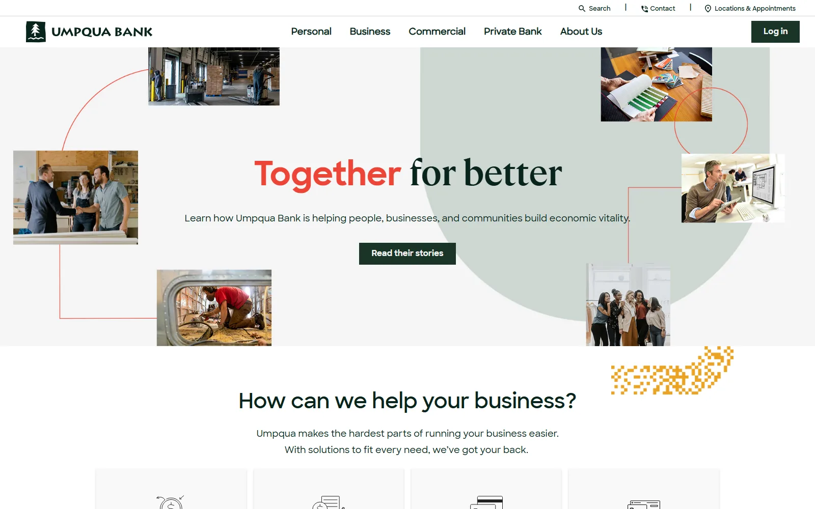
Umpqua Bank, a design reference point in banking for twenty years, now operates as Columbia Bank following a rebrand, and the new homepage hero is an abstraction of the logo mark rendered in layers of blue, with photography nowhere in sight.
 2022
2022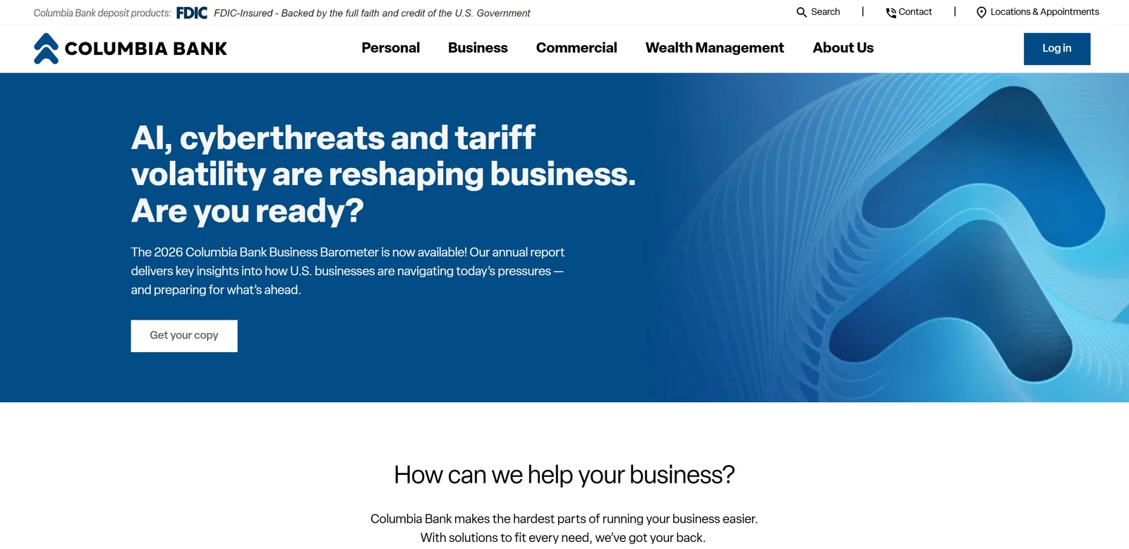 2026
2026Impersonal but Professional
There are practical reasons for the shift. Big photography is expensive to load on a phone, and page speed now affects both search ranking and conversion. The bigger force, though, is the same Silicon Valley gravity pulling on everything else in banking: an online experience that is impersonal but professional. People seem to prefer simple, effective services online over a manufactured sense of personality, and the warm handshake was always better delivered in a branch anyway.
Standing apart from the corporate fintech style is one of the few advantages a local brand has left.
The national banks are mostly falling in line. Whether community banks should follow is a harder question. It is the call Texas Regional Bank made when we rebuilt trb.bank this spring: the photographic hero stayed, with the bank's six divisions arranged around a customer instead of a stock landscape. When the banks that made photographic heroes famous walk away from the format, it is fair to call it a turning point. It is also worth asking whether your bank wins by joining it.
A Growing Diversity of Services
Read the top navigation across this group of sites and you can watch banks widening their business model in real time.
Wealth and Advice Join the Menu
Columbia Bank's menu runs Personal, Business, Commercial, and Wealth Management. Camden National places Wealth alongside Personal and Business. American Eagle Financial Credit Union gives Advice and Planning the same billing as checking and loans. When we rebuilt Texas Regional Bank's site, the brief was the same problem at a larger scale: six lines of business, from personal checking to municipal underwriting and international private banking, each needing its own front door in the top navigation. Investment services, insurance, retirement planning, and trust departments are showing up on sites that were selling checking accounts and mortgages five years ago, because fee income diversifies a balance sheet that deposit competition keeps squeezing.
| Bank | Top-level navigation | Wealth or advice item |
| Columbia Bank | Personal · Business · Commercial · Wealth Management | Wealth Management |
| Camden National Bank | Personal · Business · Wealth · Resources | Wealth |
| Texas Regional Bank | Personal · Business · Trust & Wealth · Insurance · Capital Markets · International | Trust & Wealth |
| Frost Bank | Personal · Small Business · Commercial · Wealth | Wealth |
| American Eagle FCU | Checking · Savings · Loans · Advice & Planning | Advice & Planning |
| Chase | Checking · Savings & CDs · Credit cards · Home loans · Auto · Investing by J.P. Morgan · Education & goals · Travel | Investing by J.P. Morgan |
| Webster Five | Commercial · Business · Personal · Learning Center | — |
Simplicity Becomes a Survival Skill
Every added line of business is another section competing for menu space, and this is where the diversification trend collides with the minimalism trend. A bank offering nine product families needs navigation that sorts visitors by intent before it ever shows them a product list. The Personal and Business split we covered in our review of this year's small-bank launches is the standard answer (it is also how we structured Texas National Bank's new site, with an International path added for a border-market bank), and information architecture, the discipline of deciding what goes where and why, has quietly become the hardest part of designing a bank website.
The Missing AI
Scan these nine homepages for any mention of AI and you will find it in exactly one context: threat.
On the Homepage, AI Appears Only as a Threat
AI, cyberthreats and tariff volatility are reshaping business. Are you ready? Columbia Bank homepage hero, August 2026
That is the pattern across the industry. When AI appears on a bank website in 2026, it is framed as something the bank protects you from.
Quiet Adoption Behind the Scenes
The quiet part is that banks are adopting AI aggressively behind the scenes. Read the trade press or talk to bank employees and you will hear about AI in fraud detection, document processing, call centers, and marketing operations. Almost none of it reaches the homepage, and we think that is deliberate. Banking is heavily regulated, model governance requirements are real, and the public backlash around AI makes it a third rail for a brand built on stability. We laid out what a compliant bank chatbot actually looks like earlier this year, and none of it is homepage material.
Nobody wants to be the bank that appears to be experimenting with your money.
We expect banks to keep adopting AI in the back office while saying very little about it out front, a dynamic we explored in our look at how banks show up in AI-powered search.
AI's Fingerprints on the Sites Themselves
The one place AI is already visible, if you know what to look for, is in the quality of the sites themselves. AI tooling has collapsed the cost of building polished, custom websites (it is a big part of how a six-person team like ours ships custom sites), and we expect that to pull banks away from the templated platforms that dominated community banking for the past decade, WordPress chief among them. The next wave of bank sites will be faster, more custom, and more consistent, and some will carry the telltale fingerprints of AI-assisted design. Most visitors will read that polish as professionalism, and they will be right more often than not.
What This Means if You Are Responsible for a Bank's Website
The through-line in all five trends is that the website has become the bank's primary trust surface. The cheapest moves are already standardized, and they do measurable work with customers who are more worried about scams every year.
The first three moves cost a fraction of a redesign. The bigger decisions are structural, and they are now visible to every customer who has used a fintech app. A simpler page has become its own kind of trust signal, and the banks that understand that are pulling ahead in ways that show up well beyond the marketing department.
Wondering how your bank's website measures up against these trends? See how we work with banks and the bank sites we have built, or let's talk.
Let's work together
Ready to take your
business further?
Tell us about your project and let's create something extraordinary together.