Website Design & Development
What Banks Need to Know About the FDIC Official Digital Sign
October 6, 2026 · 12 min read · MPC Studios
For generations, bank teller windows have carried the FDIC's official sign, the small plaque that tells customers their deposits are insured. Most customers now open accounts and check balances on their phones, so in December 2023 the FDIC extended the sign to bank websites and mobile apps. The digital version is called the FDIC official digital sign: the bold FDIC wordmark followed by a line of smaller italic type reading FDIC-Insured, backed by the full faith and credit of the U.S. Government. The FDIC pushed the deadline back three times, then revised the rule in January 2026. Compliance is now required by April 1, 2027.
Most banks are getting there early. On September 28, 2026, we loaded the homepage of every FDIC-insured bank headquartered in Texas that listed a website with the FDIC, and 240 of the 291 homepages that loaded already show the sign. That's 82% of them, six months ahead of the deadline. This guide covers the website side of the rule: the three pages that need the sign, what it has to look like, the places banks tend to slip, and what to settle with your technology vendors before their year-end code freezes. We build and maintain websites for community banks, including Texas Regional Bank, whose site appears in several of the examples below.
Which pages need the FDIC official digital sign?
Three pages need the sign: your homepage, your login page, and the page where a customer first starts opening a deposit account. The regulation calls them the "initial page or homepage of the website or application," the "login page," and the "page or screen where the consumer first initiates a deposit account opening." The same three apply to your mobile app.
The rule covers what the FDIC calls a digital deposit-taking channel, meaning any bank website or app that lets customers make deposits electronically and get to the deposits they already have. According to the FDIC's Q&As, a purely informational site with no way to make or reach deposits falls outside that definition. Most bank websites link customers into online banking and account opening, so plan on yours being covered.
For account opening, only the first screen counts. The final rule says the sign is required "only on the first page or screen of the deposit account opening process," so a five-step application needs it on step one.
Several kinds of pages are outside the rule. Once a customer logs in, the dashboard that summarizes their balances doesn't need the sign, and the 2026 amendments dropped the old requirement to show it on pages where customers move money. You don't have to repeat it every time the bank's name appears. The FDIC's Q&As also say the sign isn't needed in an app store listing, in downloadable documents like terms and conditions, or in social media ads. Marketing pages that promote deposit products count as advertisements, and advertisements carry the familiar "Member FDIC" statement under a separate section of the rule, 12 CFR 328.6.
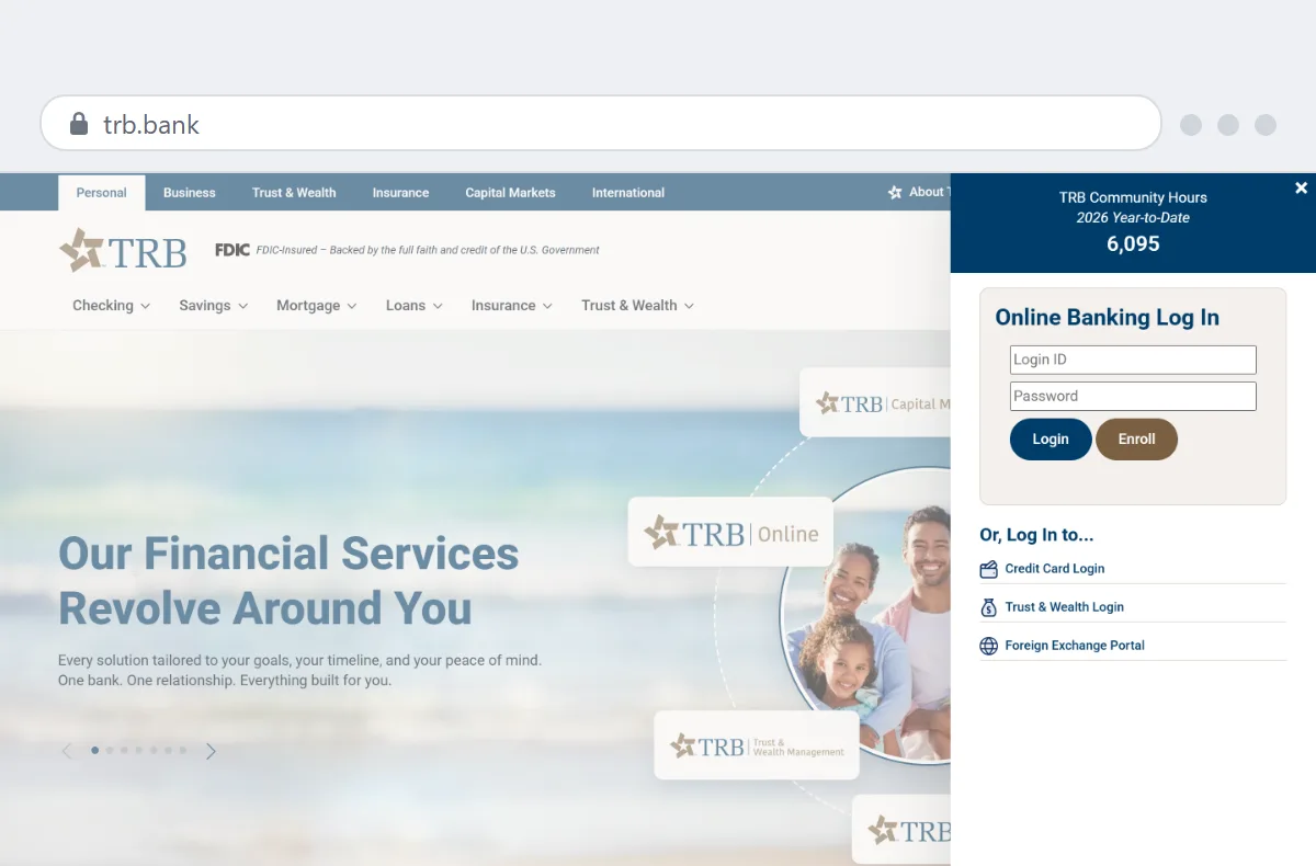 Homepage
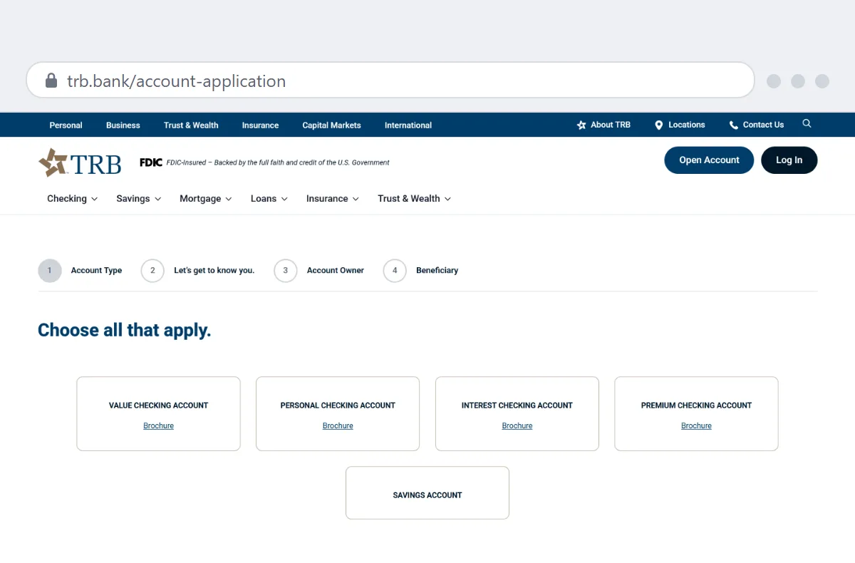 Account opening
What changed in the January 2026 amendments?
If your bank added the sign in 2024 or 2025, most of that work still counts. The January amendments mostly gave banks more room.
| 2023 rule | January 2026 amendments | |
| Pages that need the sign | Homepage, "landing or login pages," and pages where customers can transact with deposits | Homepage, login page, and the first page of account opening |
| Design | Exact color codes and wordmark sizes | Navy blue or black (white on dark backgrounds), Source Sans Pro Web or a similar font, and wrapping allowed |
| Non-deposit notices | Every page "relating to" non-deposit products | Pages "primarily dedicated" to non-deposit products |
| One-time notice when leaving for a third party | The customer had to dismiss it | The customer dismisses it, or it disappears after at least three seconds |
| Compliance date | Delayed three times | April 1, 2027 |
One change can catch banks that finished early. The FDIC declined to grandfather banks that already met the 2023 version, and the final rule names the likely gap: the old text never made clear whether account-opening pages needed the sign, and the new text requires it on the first one. If your sign went up before 2026, check your account applications first.
ATMs have their own section of the rule, 12 CFR 328.4, and the amendments simplified it too. Machines placed in service on or before April 1, 2027 can keep using the physical sign.
What does the sign have to look like?
The wording is fixed. The sign is the FDIC wordmark in bold, followed by a smaller line in italics that reads FDIC-Insured, then Backed by the full faith and credit of the U.S. Government. Both parts are navy blue or black, or white when the sign sits on a background dark enough to make navy or black hard to read. The regulation asks for Source Sans Pro Web "or similar font" and lets the line wrap when space is tight.
The 2023 version of the rule spelled out exact color codes and sizes. The January amendments dropped them, and the FDIC explained that it wanted banks to "exercise reasonable judgment" about technical limits like space constraints, font availability, and what counts as navy blue.
The FDIC's Q&As settle a few more questions. The words can't be edited, and the sign has to appear in English. A bank can add a translation next to it, which matters for banks in South Texas and elsewhere that run bilingual sites. The sign doesn't have to link anywhere, though the FDIC offers optional versions that link to BankFind, its tool for confirming that a bank is insured, and to EDIE, its deposit insurance calculator. Bankers can download those and the standard sign from FDICconnect, the FDIC's secure site for insured institutions.
Build the sign as live text, or as an image whose alt text includes the full wording. Alt text is the description a screen reader reads aloud in place of an image, and without it a blind customer never hears the sign. The FDIC's Q&As point out that the signage rule doesn't change a bank's obligations under the Americans with Disabilities Act.
Where does the sign go on the page?
The standard is that the sign be displayed "clearly, continuously, and conspicuously." The regulation gives three examples that meet it. On a website homepage, the sign sits near the top of the page next to the bank's name. On a mobile app's login screen, it sits immediately next to the username and password fields. On a web account-opening page, it sits near the top or center. The FDIC says these examples are suggestions and don't require any particular spot on the page.
The FDIC's Q&As fill in the rest. A logo counts as the bank's name, so a sign beside the logo fits the first example. The footer is acceptable as long as the sign is still clear, continuous, and conspicuous there. "Continuous" means the sign stays visible on those three pages and can't be dismissed, and the Q&As add that it doesn't have to follow visitors as they scroll.
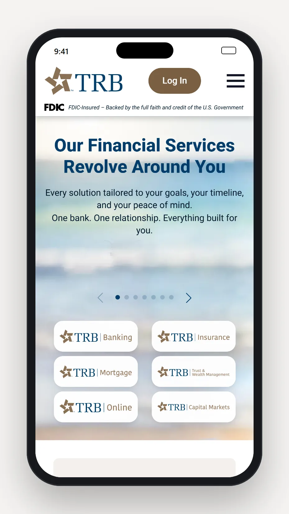
On phones, the sign can be scaled down, wrapped onto two lines, or stacked. We build the sign into the site header, so it appears on every page that uses the header, including the three that require it, and nobody has to remember to add it to a new page. On Texas Regional Bank's phone layout, the header gives the sign its own line under the logo.
What we found on 291 Texas bank homepages
On September 28, 2026, the FDIC's BankFind database listed 347 FDIC-insured banks headquartered in Texas, and 343 of them listed a website. We loaded every one of those homepages that day, and 291 loaded for our automated browser.
82%
Texas bank homepages that already show the FDIC official digital sign (240 of 291)
MPC Studios survey, September 28, 2026
94%
Signs placed within the first 200 pixels of the page, above or beside the logo
MPC Studios survey, September 28, 2026
27%
Signs posted as images without alt text that carries the sign's words
MPC Studios survey, September 28, 2026
Adoption barely varies by size. Banks under $250 million in assets were at 84%, about the same as banks between $1 billion and $10 billion at 82%. Nearly all of the signs sit at the very top of the page, in a thin strip above the header or on the same line as the logo, and within those rules banks have found plenty of room for their own look.
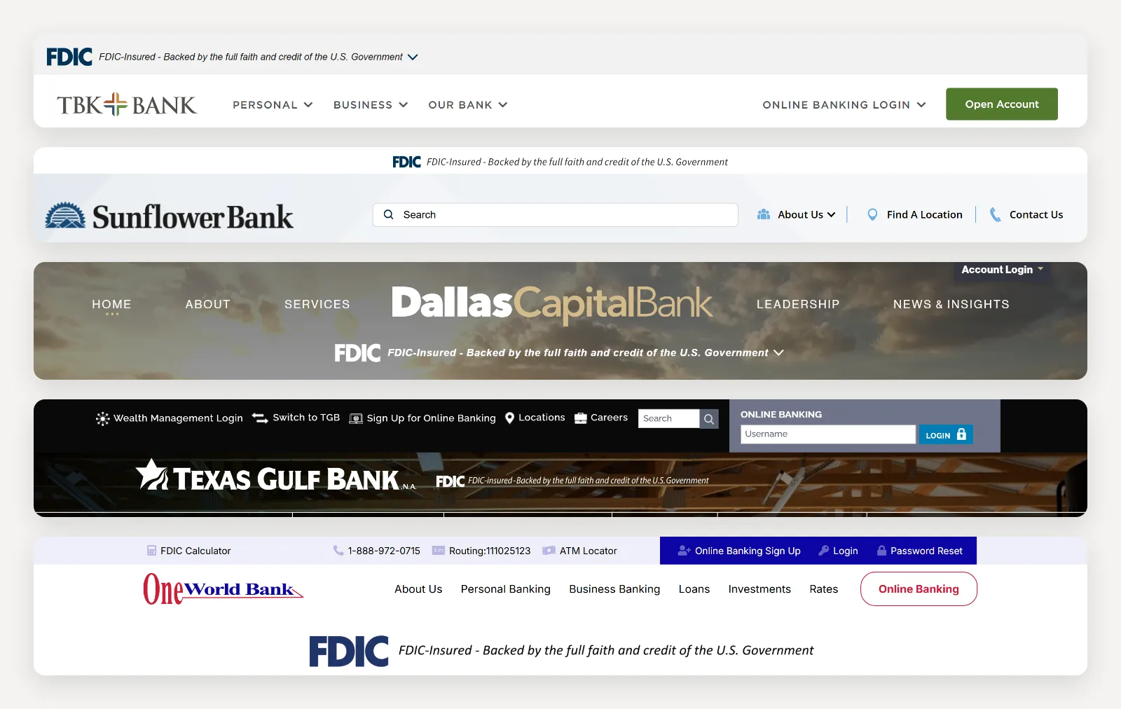
The survey also turned up the mistakes most worth avoiding. About a quarter of the signs we found (65 of 240) were images whose alt text was missing or left out the sign's words, and two were labeled as a "Member FDIC" logo. Among the 51 homepages without the digital sign, 23 displayed "Member FDIC," the advertising statement, which is a separate requirement. Three showed a picture of the physical teller-window sign, and one used FDIC-Insured without the rest of the line.
How we counted: we pulled every active FDIC-insured institution headquartered in Texas from the FDIC's BankFind database and loaded each listed homepage in an automated browser. BankFind can take weeks to reflect a merger, so the list is a snapshot of that day. The 52 homepages that blocked automated visitors or timed out are left out. A homepage counted if the sign's wording appeared on the page or if we could see the sign in a screenshot. We checked homepages only, so these numbers say nothing about login or account-opening pages, and they aren't a compliance finding. Compliance isn't required until April 1, 2027.
Login and account opening often run on someone else's platform
On most community bank sites we work on, the bank's own website hands customers off to other systems. Online banking typically runs on a digital banking provider's platform, and account opening often runs on a separate vendor's application. The login box on the homepage sends customers into the provider's system, and the provider usually has a standalone login page of its own, which customers see after a mistyped password, a password reset, or a saved bookmark. Every one of those screens is a login page from the customer's point of view.
The regulation doesn't carve out pages that a vendor hosts, so plan on the sign appearing on the provider's login page and on the first screen of every account application, including business accounts and any product-specific flows. Ask each vendor how the sign will be added and when, and get the answer in writing. Texas Regional Bank's account application runs on trb.bank itself, so the sign in the site header appears on step one without any vendor work.
Timing is the hard part. When the FDIC took comments on the 2026 changes, commenters warned that vendor updates take time and that many vendors impose year-end blackout periods, stretches when they freeze changes to their platforms. The FDIC set the April 2027 date partly to give banks at least a full year to finish. With the holidays coming, the working calendar is shorter than it looks. Mobile apps add a step, because an app update has to clear Apple's and Google's review before customers see it.
Investment and insurance pages need a different notice
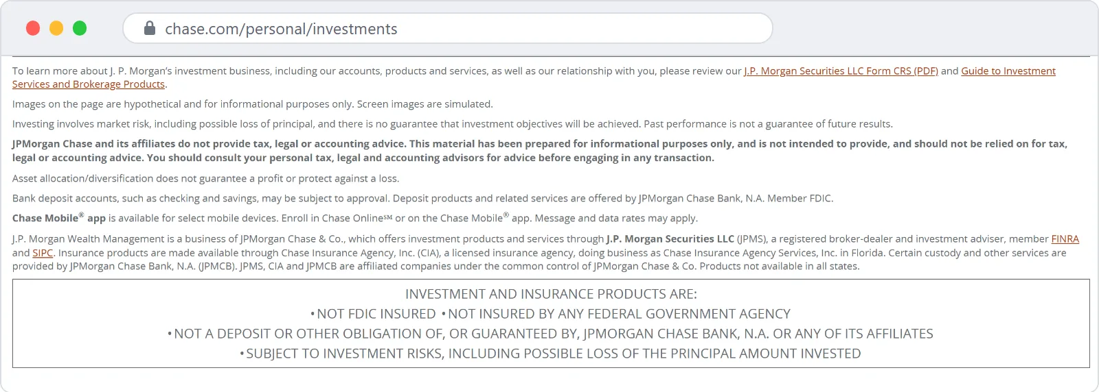
Non-deposit products are the investments, annuities, and insurance a bank may offer that the FDIC doesn't insure. The rule requires a separate notice on every page "primarily dedicated to advertising or providing information about, or access to" those products. The FDIC's example is the set of pages you reach by clicking a tab like Investing or Wealth Management. A homepage that happens to link to those pages doesn't qualify, and neither does a navigation menu.
The notice has to say that the products are not insured by the FDIC, are not deposits, and may lose value. The FDIC's Q&As accept the shorter wording many banks already use for investment products, "not FDIC insured; no bank guarantee; may lose value," and the final rule also accepts the longer disclosures required under the FDIC's insurance sales rules and FINRA Rule 3160.
Placement is flexible. Disclosures usually sit near the bottom of a page, and the FDIC says that works "so long as the text is displayed more prominently than footnotes," for example in a text box or in bolder or larger type than the smallest text on the page. The agency also warned that a notice at the bottom of the page "in very small text size" wouldn't meet the standard.
Business sweep accounts, which move money from checking into investments overnight, are what the rule calls hybrid products. Sweep accounts need neither the sign nor the non-deposit notice, though other FDIC disclosure rules still apply to them.
The one-time notice when logged-in customers leave
The last piece applies when a logged-in customer clicks a link that takes them off the bank's platform to a third party's website or app that offers non-deposit products. Before the customer leaves, the bank has to show a one-time notice saying those products are not insured by the FDIC, are not deposits, and may lose value. The FDIC treats a bank's own affiliates as third parties, so a link to an affiliated brokerage counts.
The FDIC's Q&As describe the notice as a pop-up, speed bump, or overlay, the kind of interstitial screen many bank sites already show before sending visitors to another company's website. Customers can dismiss it with a click or a swipe at any time, or it can disappear on its own after at least three seconds, or the bank can allow both. The notice appears once per session for each link, so a customer who clicks the same link twice sees it once, and a link to a different third party gets its own notice. Banks can add language of their own, such as a line saying the customer is leaving the bank's website.
Most logged-in sessions happen inside the online banking platform or the mobile app, which makes this notice a vendor setting at most community banks. Add it to the same vendor conversation as the login page.
A checklist for the months before April 1, 2027
- List every screen where a customer can log in or start an account, including the homepage login box, your online banking provider's standalone login page, your mobile app's login screen, and the first screen of each account application.
- Confirm the sign appears on each of those screens and on the homepage of both your website and your app, near the top and next to your name or logo unless your compliance team has approved another spot.
- Check every one of those screens at phone widths, where the sign should scale, wrap, or stack without getting cut off.
- Switch to the white version anywhere the sign sits on a dark color or a photo.
- Make sure the sign is live text or carries alt text with its full wording, so screen reader users get it too.
- Replace any "Member FDIC" logo or photo of the physical sign that is standing in for the digital sign. The "Member FDIC" statement still belongs on your ads.
- Add the non-deposit notice to every page devoted to investments or insurance, and set it apart from the fine print.
- Set up the one-time notice for logged-in customers who follow links to a third party's investment or insurance platform, including any affiliate's.
- Get a written date from every vendor involved before their year-end freeze, and leave room for app store review.
- Check everything again in early 2027, after the vendor releases land, because a platform update can quietly undo finished work.
What banks can take from all of this
The sign is a small piece of type, and the banks that handle it well treat it as a design decision. As we noted in our look at 2026 bank website trends, the strongest redesigns put the sign at the very top of the page, where it reads as a trust signal to customers who worry more about scams every year. Building it into the site header puts it on every page that uses the header, which covers the homepage and any login or application pages the bank runs on its own site.
The harder work sits at the seams between systems. A bank's website team can update the homepage in an afternoon, while the pieces that run on vendors' platforms, from login pages and account applications to the mobile app, take months of calendar time. That pattern holds for most compliance work on the web, including the versioned disclosure system we built for Texas National Bank. Banks that start those vendor conversations this fall will have room for year-end code freezes and app review.
The rule is also a good reason to look at how clearly a site separates insured deposits from the products that aren't insured. Customers can't tell a savings account from an annuity at a glance, and the sign, the non-deposit notice, and the one-time notice exist to tell them. Doing all three well, in text a screen reader can read, gives every customer the same answer to the question the teller-window sign has always answered.
We build and maintain websites for community banks across Texas. See how we work with banks, our website design and development work, and the bank sites we've built.
Getting your bank's website ready for April 1, 2027? Let's talk.
Let's work together
Ready to take your
business further?
Tell us about your project and let's create something extraordinary together.