Website Design & Development
The Lunch Crowd and the Event Planner: How City Café & Catering's New Restaurant Website Serves Both
February 23, 2026 · 9 min read · MPC Studios
Most people meet a restaurant's menu before they meet the restaurant. In a September 2023 survey of 1,003 Americans by the foodservice distributor US Foods, 83% said they review a restaurant's menu before setting foot inside. For a neighborhood café, that makes the website part of the front door, the place where the lunch decision gets made, and for many diners that decision happens on a phone.
A restaurant that also caters has a second visitor to plan for. Someone organizing an office lunch or a 50th anniversary party is working toward a date and a guest count. That planner needs to know what the kitchen can make for a crowd, how many people each tray feeds, and who to talk to about it. Both visitors arrive at the same homepage, and a good restaurant website gets each of them to the right answer quickly.
City Café & Catering has been a McAllen favorite for decades. The café on North 10th Street is open for lunch six days a week and for dinner Tuesday through Saturday, with a menu of homemade dishes that runs from salads and sandwiches to pastas and chicken fried steak. Its catering side handles everything from office luncheons to weddings, anywhere from McAllen to Brownsville and South Padre Island, and the café's chocolate-covered strawberries have a following of their own across the Rio Grande Valley. City Café's new website went live on Friday, February 20. MPC Studios built the café's previous website too, in 2013, and has worked with City Café since 2008.
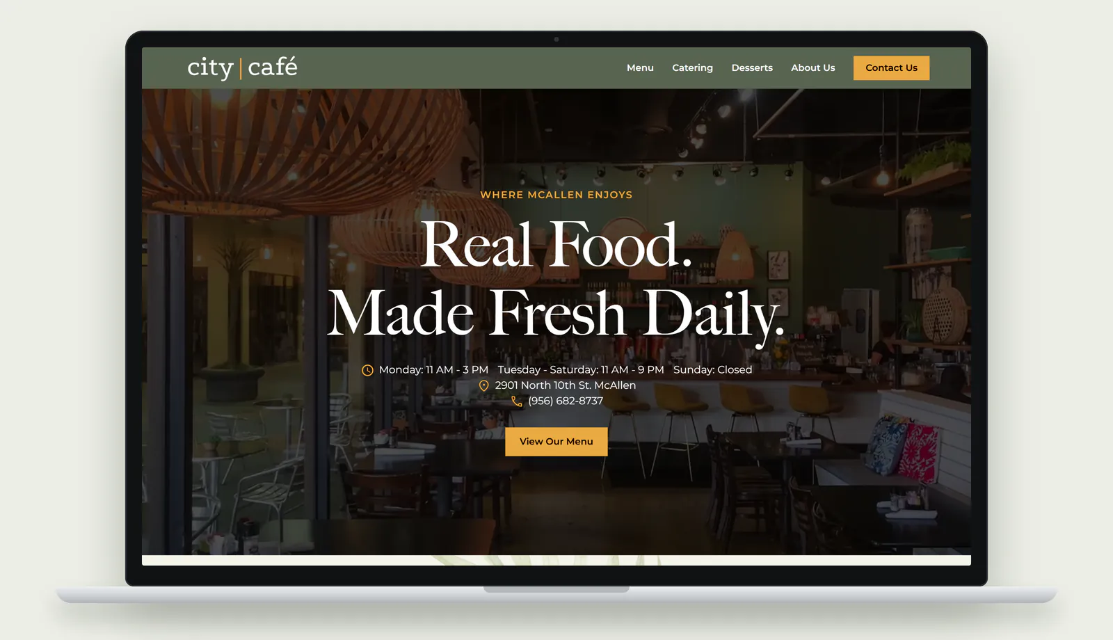
The website has always had two jobs: bring people in for a meal, and put event planners in touch with the catering team. The redesign organizes every page around those two jobs, with a third path for the dessert and gift orders the café is known for, and it keeps the café's identity intact. The café's logo carried over, and so did the exact sage green the old site used, which now runs from the navigation bar at the top of every page to the footer at the bottom. MPC's creative director, Kate Hurry, designed and built the new site, and in January our CEO, David Watkins, walked the café's team through the first homepage design.
The first screen answers the lunch question
A person picking a place for lunch wants to know whether the café is open, where it is, and what's on the menu. The new homepage answers all three before anyone scrolls. The headline promises "Real Food. Made Fresh Daily." Directly beneath it, the café's hours come first, the North 10th Street address and phone number follow, and a single gold button says View Our Menu. On a phone, all of it fits on the first screen. Tapping the address opens the café's location in Google Maps, and tapping the phone number starts a call.
The small gold line above the headline comes from the café's own history. The previous site welcomed visitors to the place "where McAllen enjoys great food made fresh," and the new homepage keeps "Where McAllen enjoys" just above the headline. Behind the text, a short video plays on a loop with the sound off. It opens on the dining room, with its woven pendant lights and bright cushions, then moves through a few of the kitchen's plates and ends on rows of chocolate-covered strawberries. The video sets the mood, and the text on top of it handles the practical questions.
We treated that menu button as the most important thing on the page. If most diners read the menu before they visit, then the path from the homepage to the menu has to be short, so one menu button sits on the first screen and another appears one scroll later.
A homepage with a door for each kind of visit
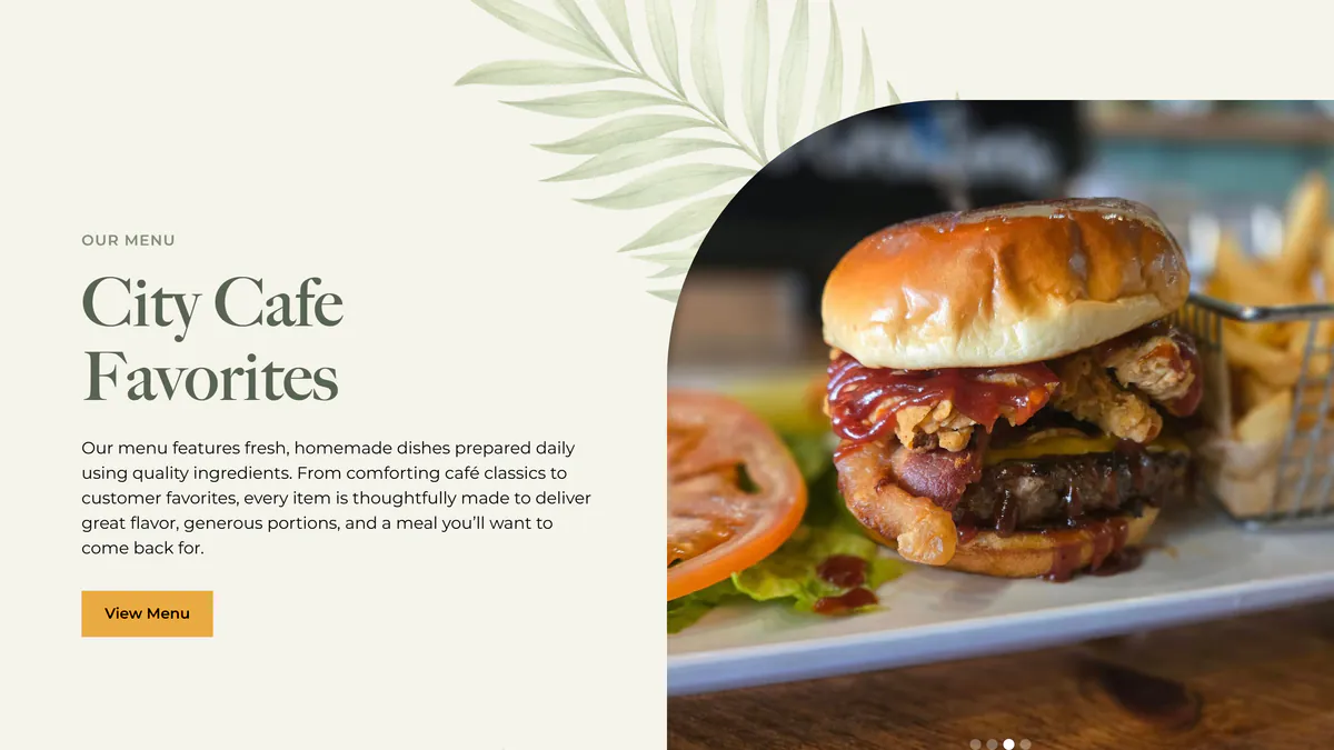
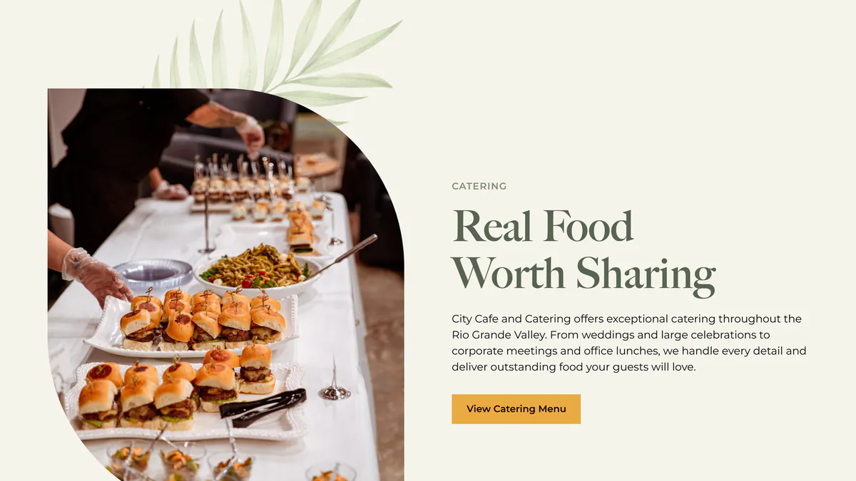
Scrolling down, the homepage gives each side of the business its own panel. The first, City Cafe Favorites, shows one dish at a time in a large rotating photo, with a button to the full menu. The second, Real Food Worth Sharing, introduces the catering service and links to the catering menu. The third covers desserts and leads to a page where the café takes orders for its chocolate-covered strawberry arrangements. The navigation follows the same order, with Menu, Catering and Desserts as the first three links on every page, so a catering customer can go straight to what they need from anywhere on the site.
 Dining
 Catering
Showing one dish at a time was a deliberate choice. When our team compared two homepage designs in January, the version we chose put a single plate on the favorites panel, so each photo gets the whole panel to itself. A large photo of one dish gives a first-time visitor something specific to want, and the menu button beside it leads to everything else the kitchen makes.
The desserts page gives the gift side of the business a page of its own. Further down that page, the café describes its strawberry arrangements as gifts for any occasion, including the ones that are "just because," and a Place An Order button takes the visitor to the contact form.
A menu that reads well on a phone
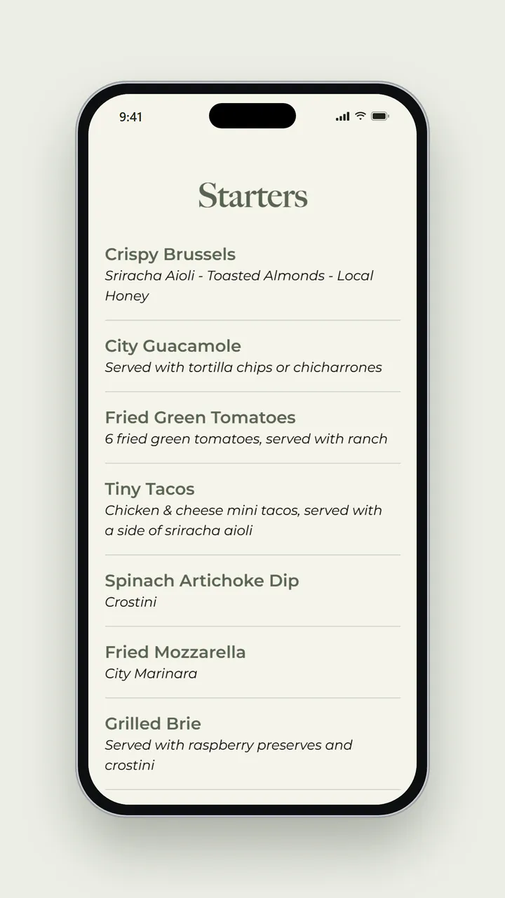
The menu page lays out the full menu as text, in sections that run from starters to beverages. Most dishes get their name in bold with a short line underneath describing what's on the plate, like the Crispy Brussels with sriracha aioli, toasted almonds and local honey, or the Chipotle Chicken Wrap made with what the menu calls "City's famous chipotle butter." On a laptop the dishes sit in two columns, and on a phone they fold into one, so a diner can scroll the whole menu with one thumb.
The catering menu is built the same way, written into the page itself, so both menus load quickly on a phone, read clearly at any size, and can be updated whenever the kitchen adds a dish or a new tray. The descriptions also help people find the café. When someone searches for a particular dish, a page that uses the same words has a better chance of showing up in the results, so we encouraged detailed descriptions from the start.
 Menu
Menu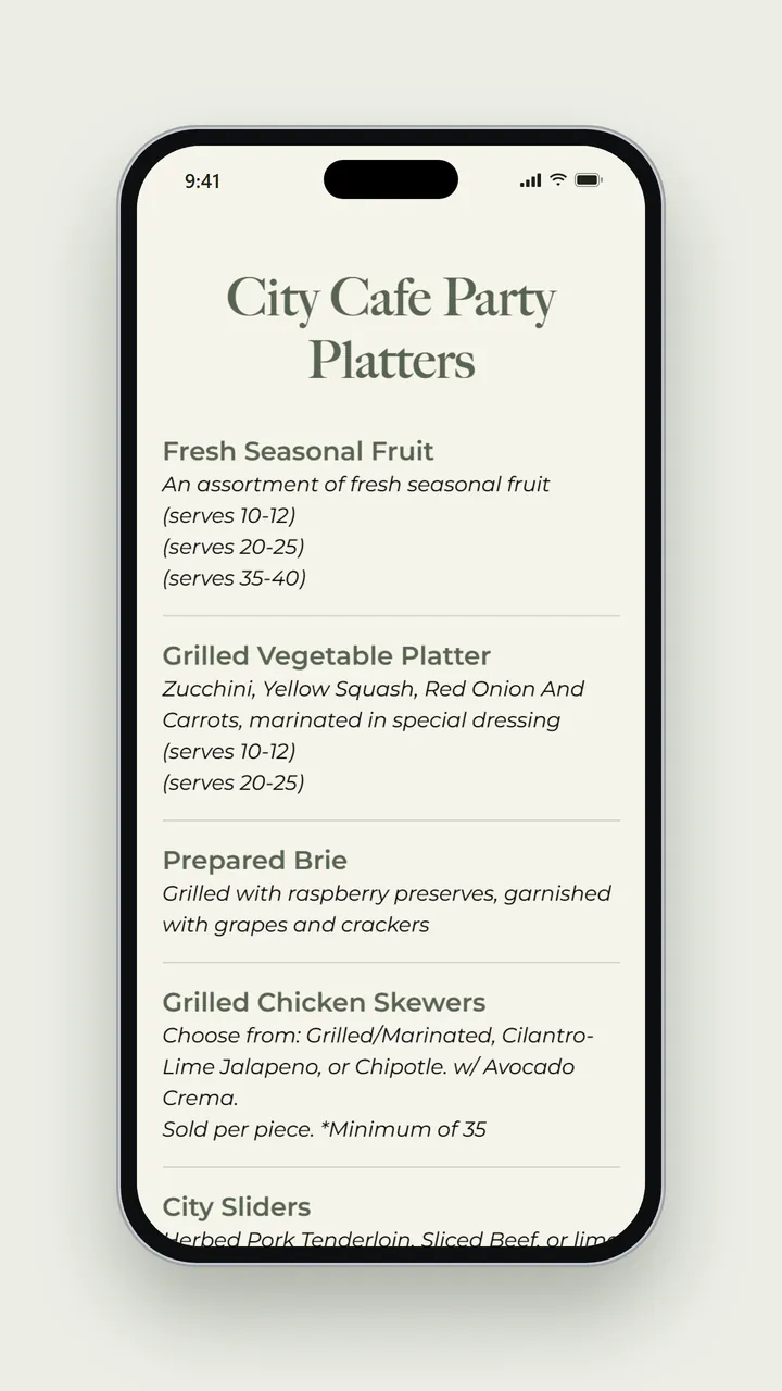 Catering
A catering page organized around the guest count
The catering page speaks to someone with an event on the calendar. It opens with where City Café caters, from McAllen to Brownsville and South Padre Island, and the range of events it handles, from boardrooms to private celebrations. Then it tells the planner exactly who to contact. Mindee handles the café's catering inquiries, and the introduction at the top of the page lists Mindee's email address.
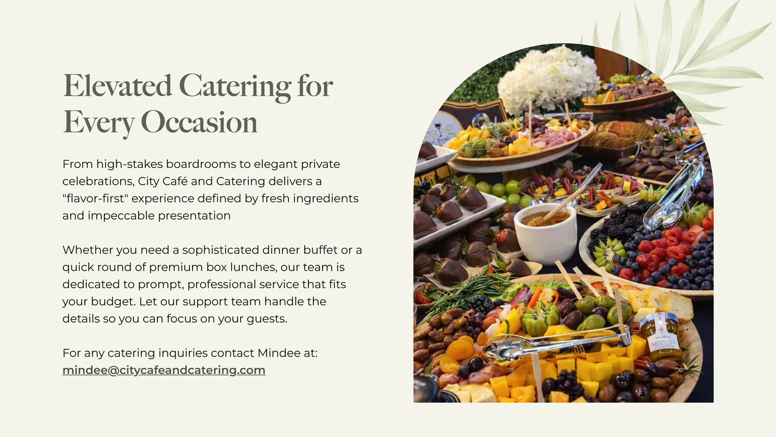
Below the introduction, the catering menu is written the way a planner thinks. Nearly every item says how many people it serves or how it's sold, so the fresh fruit platter comes in sizes for 10 to 12, 20 to 25, or 35 to 40 guests, and each pan of lasagna serves 9 to 12. The boxed lunches note a minimum order of five, the buffet-style sandwich luncheon starts at 10 guests, and the lemon and pecan bars ask for 24 hours' notice. With those details in front of them, planners can sketch an order before they ever write to Mindee, and that first email can be specific enough to answer quickly. When they are ready to reach out, the gold Contact Us button at the end of the navigation leads to the café's contact page from anywhere on the site.
Letting customers make the case
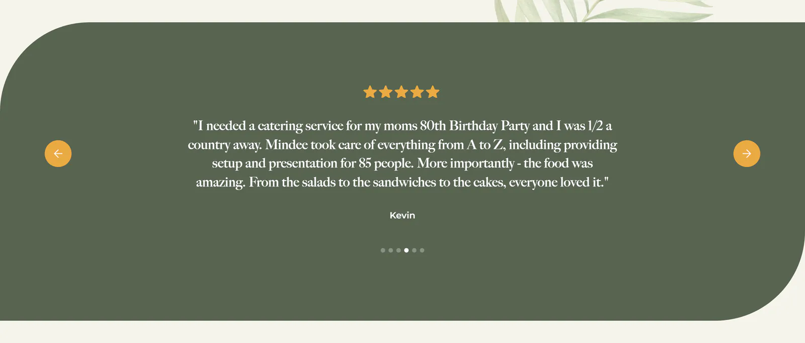
The homepage gives word of mouth a place of its own. A panel of customer quotes under a row of five gold stars rotates through six stories. Three describe everyday meals, like the diner who calls the Brussels sprouts appetizer "a must try." The other three describe events, from a 50th anniversary party to a team dinner where the staff helped plan the menu and create special drinks.
One of those event stories speaks directly to the planner. A customer named Kevin planned a family 80th birthday party from halfway across the country and writes that Mindee "took care of everything from A to Z," including setup and presentation for 85 people. Someone planning from out of town is trusting the caterer with the whole event, and a review like Kevin's shows them that someone else already did exactly that and was glad of it.
Further down, a Follow Us panel links to the café's Instagram and Facebook accounts, where the team shares everything from homemade favorites to happy hour. The footer on every page repeats the café's hours along with the address and phone number, and it invites visitors to join the café's newsletter for special menu items. That gives City Café a list of its own for announcing a new dish or a holiday order deadline, which is the kind of email a regular looks forward to.
Easy to find and quick to load
Some of the most useful work on a restaurant website happens where diners never look. Each page has its own title, the name that shows in a browser tab and as the blue headline in Google's results, written to say what the page offers and where. The homepage is titled "City Café & Catering | Fresh Local Dining & RGV Event Catering," which names both halves of the business in one line, and the catering page is titled "Catering Services in McAllen & RGV | City Café & Catering" for the planner searching for exactly that. The food photos carry alt text as well, a short written description that screen readers speak aloud for blind and low-vision visitors and that search engines use to understand an image.
The homepage also includes sharing tags, a few lines in the page's code that tell Facebook, text messages, and other apps which title and image to show when someone shares the link, so a coworker who receives the link sees the café's name and image before tapping it. The photos themselves are sized for the screen that asks for them, so a phone downloads a smaller copy of each image than a laptop does, and pictures further down the page wait to load until a visitor scrolls near them. On a phone connection, that keeps the first screen, with the hours, the address, and the menu button, quick to appear.
What other restaurants and caterers can take from this
Start with the questions a hungry person asks, and answer them on the first screen. City Café's homepage leads with when it's open, where it is and how to call, and it keeps the menu one tap away, because the menu is the page most diners want before anything else. Everything below the first screen can then give each part of the business a clear door of its own, so a lunch guest and an event planner each find their way in a single scroll.
Write each menu for the person reading it. Diners want to know what's on the plate, and a line of honest description tells them while also giving search engines the words people actually type. Planners are working backward from a guest count and a date, so a catering menu organized by headcount, with notice requirements spelled out and a real person's name at the top, turns a vague inquiry into a specific one. The same care belongs in the parts of a site nobody sees, like page titles written for the searches people make and photos sized for a phone, because they decide how quickly a diner finds the café and how fast the first screen appears.
Finally, keep what your customers already know. City Café's new site kept the logo and the sage green regulars recognize, along with the welcome line the café has used for years, so the site feels familiar the moment it loads. The reviews on the homepage then let customers from both sides of the business vouch for the café. A restaurant that caters is really two businesses sharing one kitchen, and the website works best when it treats both as the main event.
City Café & Catering's website is live at citycafeandcatering.com. Built by MPC Studios.
Is your restaurant's website working as hard for your catering business as it does for your dining room? Let's talk.
Let's work together
Ready to take your
business further?
Tell us about your project and let's create something extraordinary together.